Day 5
Friday 23rd August 2024
Stone Lithography – The last chance saloon with tusche
Yesterday’s failed attempt at producing a workable tusche produced a dilemma; I’m here for ten days and I want to leave having produced at least one piece of work, however trying to get a tushe that works is proving elusive and time is running out. I can resort to simply photo transfers, litho pens and crayons and abandon tusche for this project. But part of me doesn’t want to give up – afterall how difficult can it really be?
So I’ve given myself one more day to experiment with tusche!
Using a tusche rubbing block on a glass plate,
- I mixed in some distilled water and applied it to the stone
- I mixed in some white spirit and also applied it to the stone
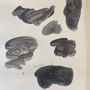
The three denser marks are with water, the more painterly ones with white spirit. The white spirit didn’t reticulate (I was expecting it to) the ones with water are perhaps too dense. Not promising so I abandon it and go back to ‘Our Lady of Pain’
‘Our Lady of Pain’ – Different colours and paper
I was intending on trying to make a two-tone print, by carefully masking out areas and attempting to carefully register the paper on the stone so that the two images overlapped perfectly. However, having lost a little bit of confidence in my ability to simply pull a new technique out of the bag, I opted for two separate colour prints of ‘Our Lady of Pain’ and then using a method of décollage, as I do with screenprinting, I’ll combine the two.
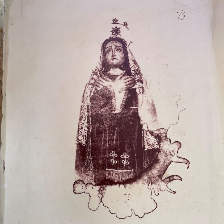
‘Our Lady of Pain’ inked in red
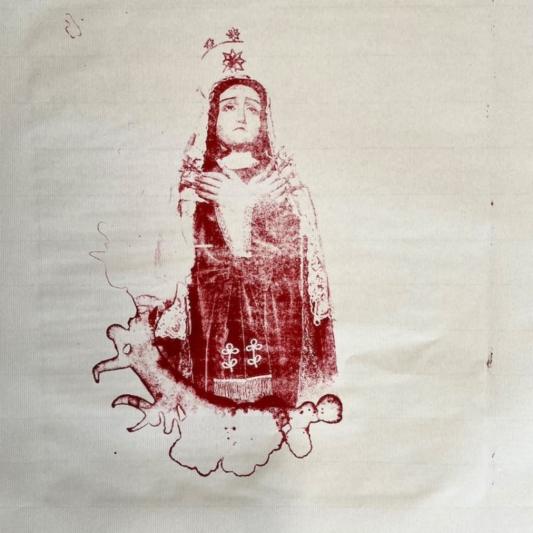
‘Our Lady of Pain’ printed on Japanese paper
For décollage, the image needs printing on thin paper. However the stone lithography press is quite an aggressive process, so paper that is structurally weak will tear. Having sourced some thin Japanese paper (52gsm) produced specifically for printing, I gave it a go. The results are similar to prints on newsprint, except of course the Japanese paper is of archival quality.
The beauty of the stones (and an opportunity too good to miss)
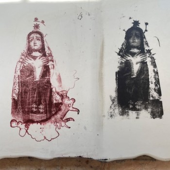
There is a beauty to the stones absent from other printing methods. The smooth surface, the weight of the stone itself and the ‘look’ of the mark making is beautiful (despite not always printing as intended!)
The two colours of ‘Our Lady of Pain’ above are very evocative and quite powerful.
I did decide to take the cheeky opportunity to place my stone next to Paula Rego’s.
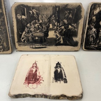
If nothing else, I can now at least drop into conversation, without giving too much away, that “yes, my work was placed next to Paula Rego’s once”.
A breakthrough
Having used the ready-made tusche and the rubbing stick to mix my own with little success, the final option was to use a tusche paste.
Two varieties were added to the stone. One mixed with water and the other added to white spirit.
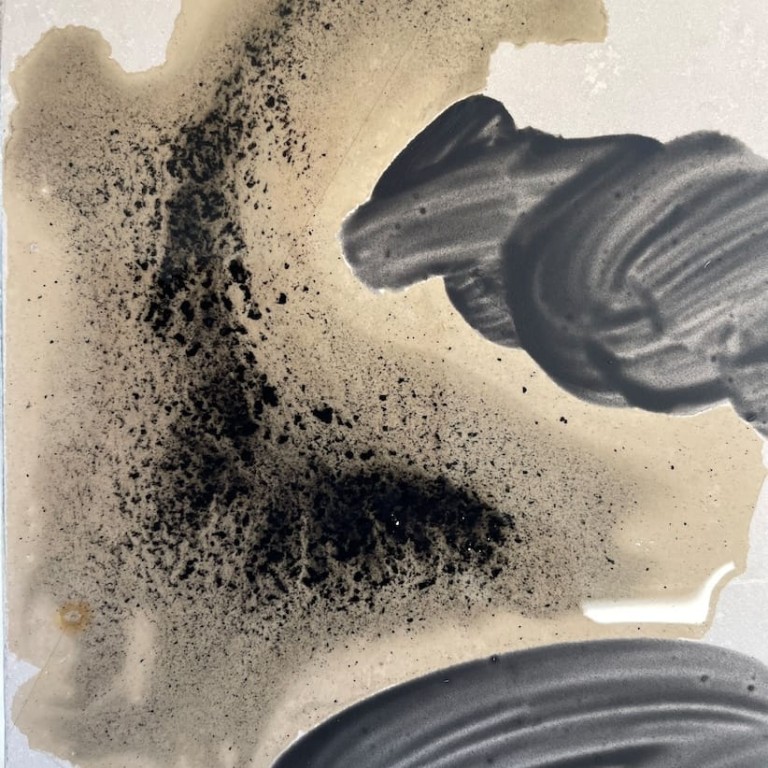
Tusche paste mixed with water
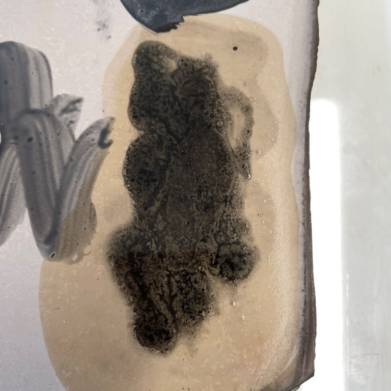
Tusche paste dropped on to white spirit
Finally I managed to achieve the desired effect. The washes reticulated and in two quite distinct ways. Leaving them to dry overnight, the hope is that these would ultimately print in an interesting way.
The last job of the day was to grind the large stone and sadly remove the beautiful transfer of ‘Our Lady of Pain’. Quite stubborn to remove, but forty five minutes of grinding later, they were gone. Short lived but at least they spent part of their lives next to a Paula Rego.